import numpy as np
import pandas as pd
import matplotlib.pyplot as plt
import seaborn as snsI Visualization of statistical relationships (“relplot”)
%%javascript
IPython.OutputArea.prototype._should_scroll = function(lines) {
    return false; // disable auto scrolling
}
Based on https://seaborn.pydata.org/tutorial/relational.html
Simple scatter plot
tips = sns.load_dataset("tips")
tips.head()| total_bill | tip | sex | smoker | day | time | size | |
|---|---|---|---|---|---|---|---|
| 0 | 16.99 | 1.01 | Female | No | Sun | Dinner | 2 |
| 1 | 10.34 | 1.66 | Male | No | Sun | Dinner | 3 |
| 2 | 21.01 | 3.50 | Male | No | Sun | Dinner | 3 |
| 3 | 23.68 | 3.31 | Male | No | Sun | Dinner | 2 |
| 4 | 24.59 | 3.61 | Female | No | Sun | Dinner | 4 |
sns.relplot(data=tips,
            x="total_bill",
            y="tip")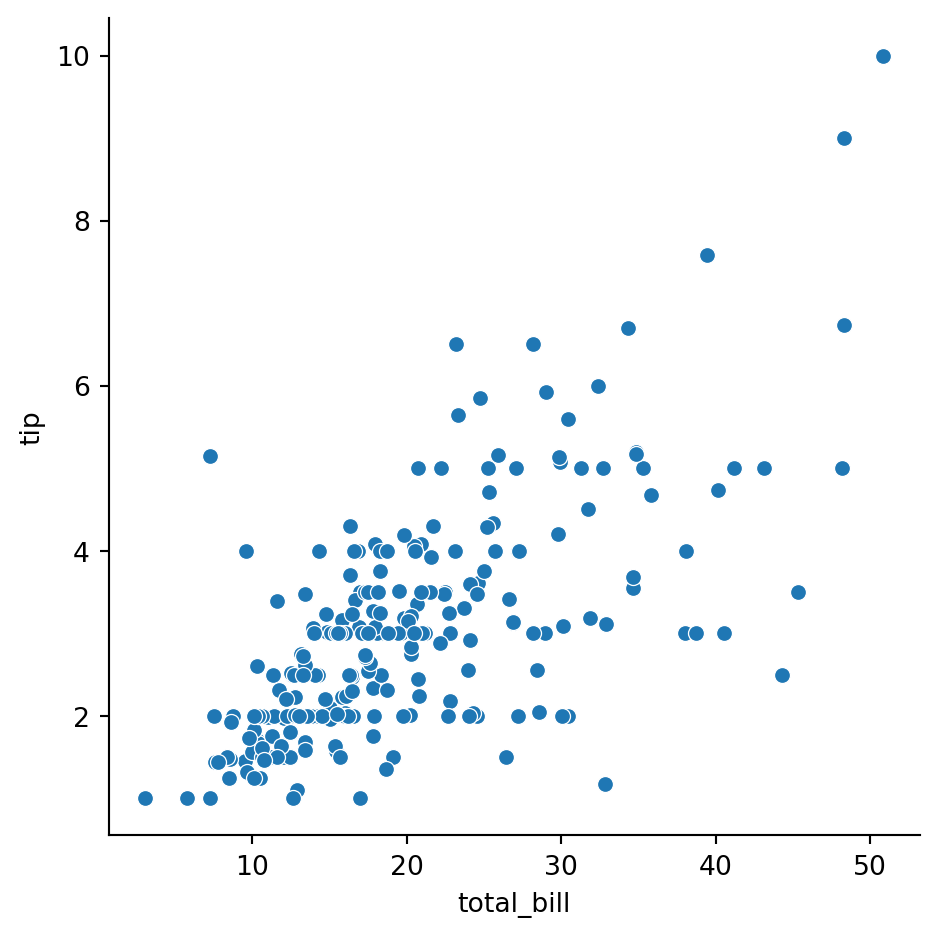
Simple scatter plot: different colors for different categorical value
sns.relplot(data=tips,
            x="total_bill",
            y="tip",
            hue="time")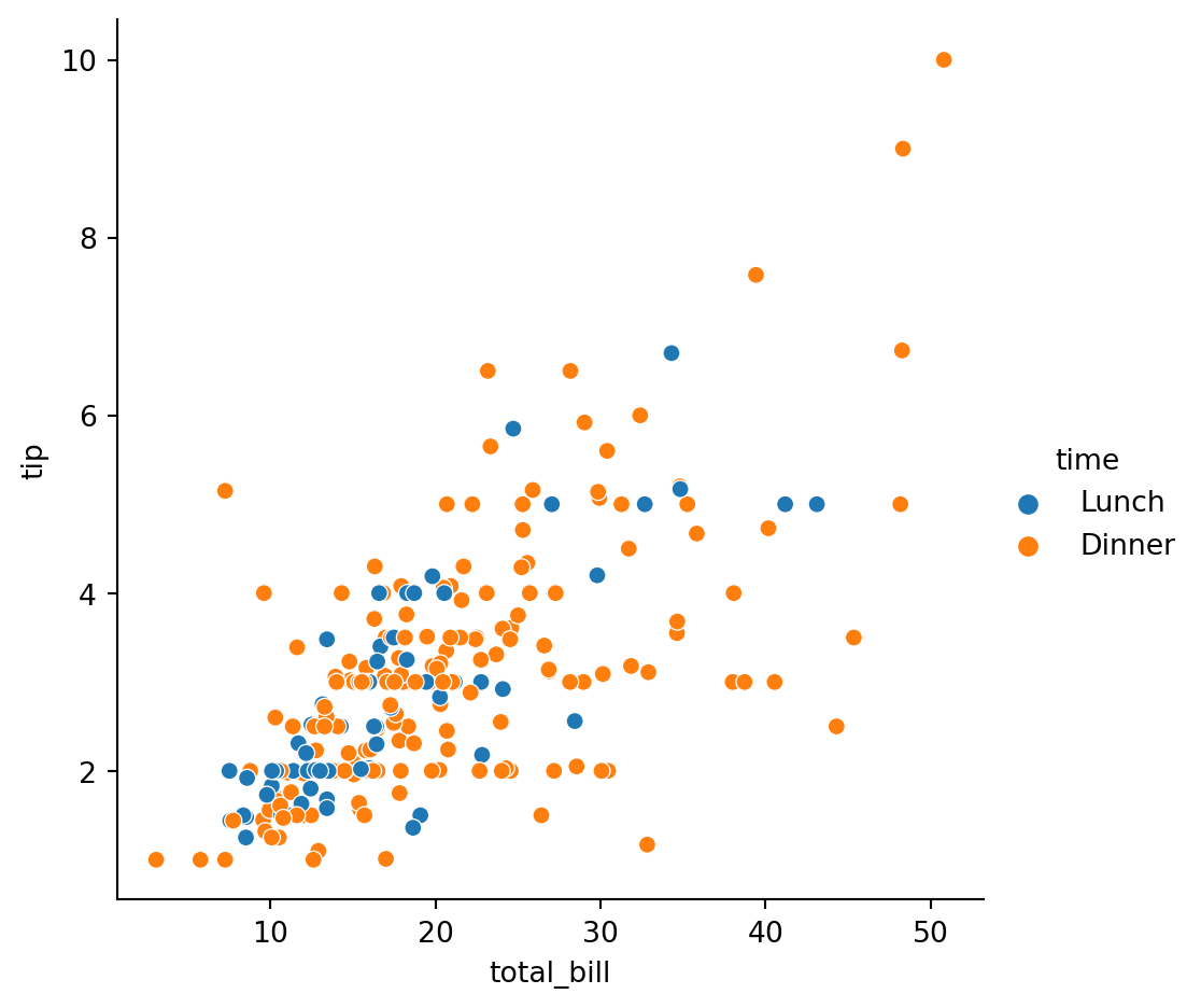
Different colors/markers based on categorical values
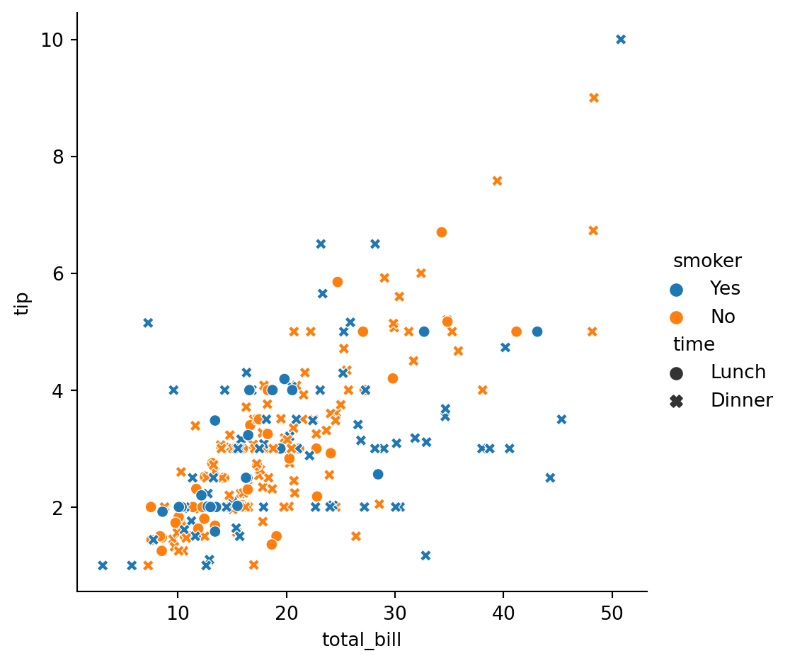
sns.relplot(
    data=tips,
    x="total_bill",
    y="tip",
    hue="smoker",
    style="time",
)
Add information about a third variable with color
sns.relplot(
    data=tips,
    x="total_bill",
    y="tip",
    hue="size",
)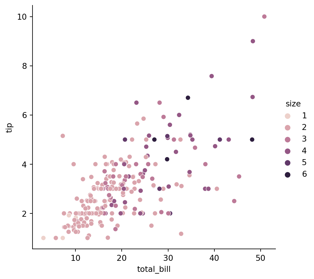
Add information about a third variable with size
sns.relplot(data=tips,
            x="total_bill",
            y="tip",
            hue='time',
            size="size")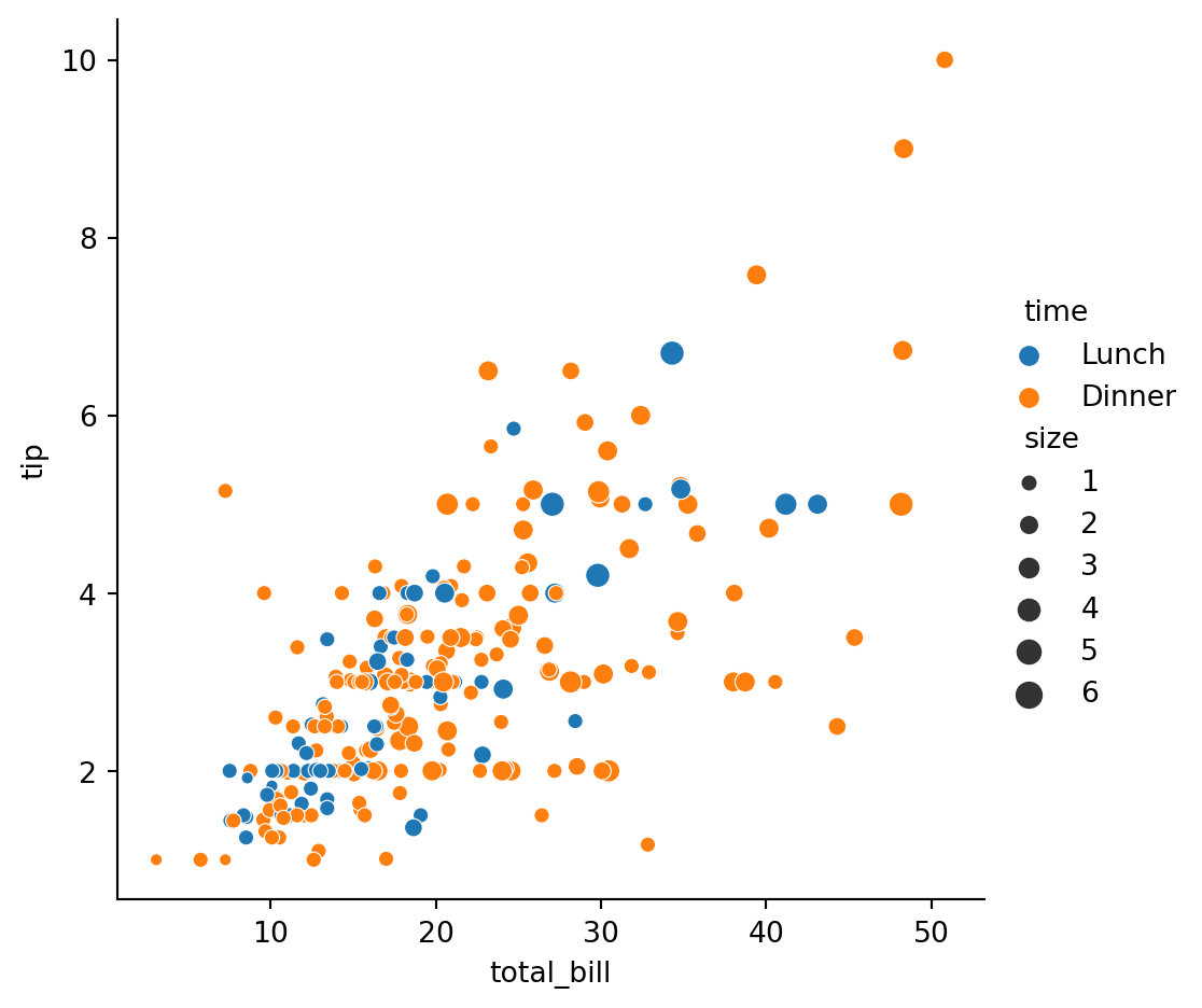
sns.relplot(data=tips,
            x="total_bill",
            y="tip",
            hue='time',  # colors
            style='day', # markers
            size="size", # size of the points
            col='sex',   # subplots in columns
            kind='scatter', # lineplot or scatterplot
            row='smoker')  # subplots in the rows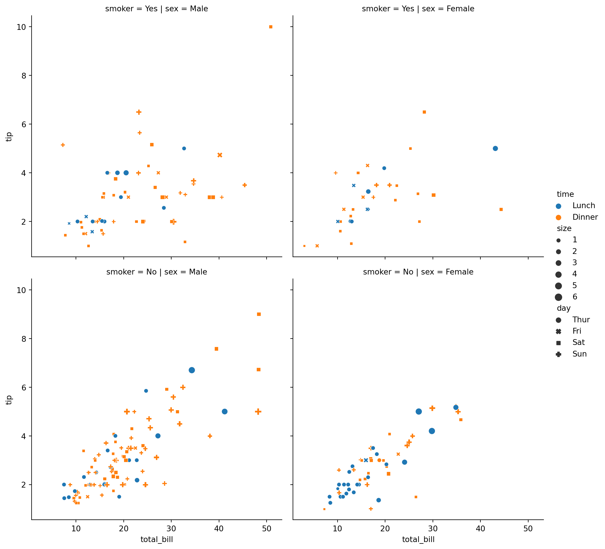
sns.relplot(data=tips,
            x="total_bill",
            y="tip",
            hue='time',
            style='sex',
            size="size")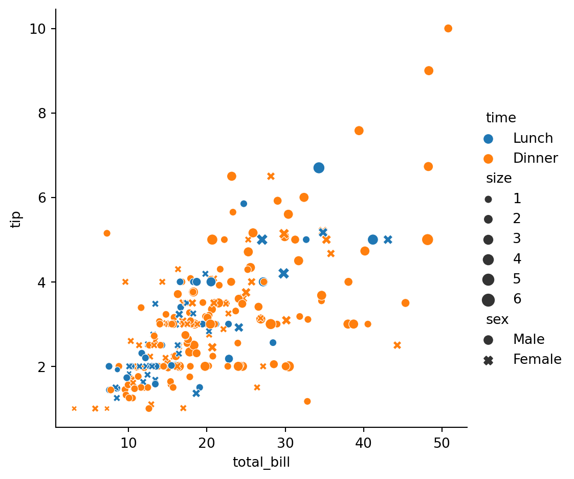
Stock prices (emphasize continuity
dowjones = sns.load_dataset("dowjones")
dowjones.head()| Date | Price | |
|---|---|---|
| 0 | 1914-12-01 | 55.00 |
| 1 | 1915-01-01 | 56.55 |
| 2 | 1915-02-01 | 56.00 |
| 3 | 1915-03-01 | 58.30 |
| 4 | 1915-04-01 | 66.45 |
sns.relplot(data=dowjones,
            x="Date",
            y="Price",
            kind="line")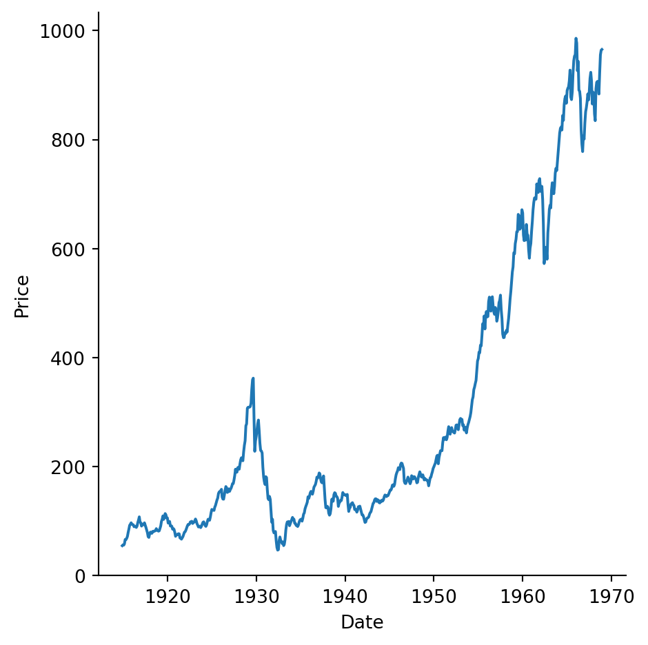
fMRI measurements (x-axis is time), several signals for each value of x
fmri = sns.load_dataset("fmri")
fmri.head()| subject | timepoint | event | region | signal | |
|---|---|---|---|---|---|
| 0 | s13 | 18 | stim | parietal | -0.017552 |
| 1 | s5 | 14 | stim | parietal | -0.080883 |
| 2 | s12 | 18 | stim | parietal | -0.081033 |
| 3 | s11 | 18 | stim | parietal | -0.046134 |
| 4 | s10 | 18 | stim | parietal | -0.037970 |
sns.relplot(data=fmri,
            x="timepoint",
            y="signal",
            kind="line")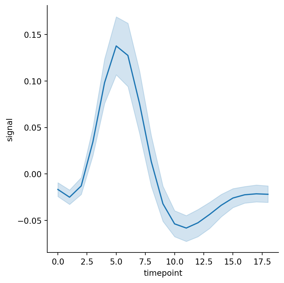
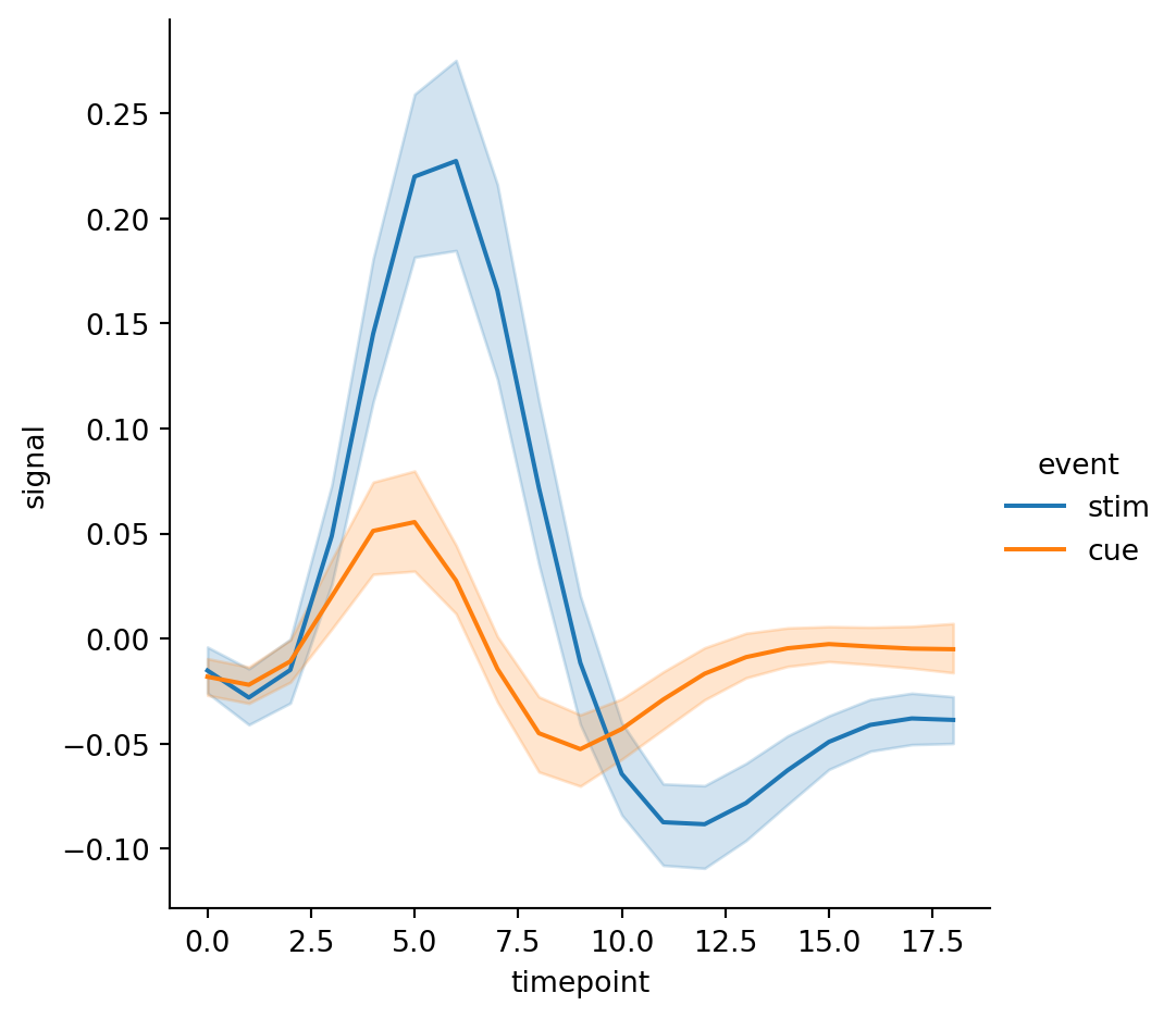
Plotting samples from different categories with different colors and styles
sns.relplot(
    data=fmri,
    kind="line",
    x="timepoint",
    y="signal",
    hue="event",
)
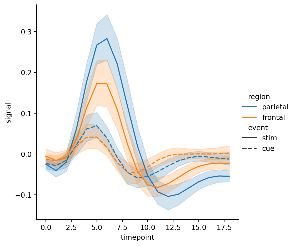
sns.relplot(
    data=fmri,
    kind="line",
    x="timepoint",
    y="signal",
    hue="region",
    style="event",
)
Plotting samples from different categories on different subplots
sns.relplot(
    data=fmri,
    kind="line",
    x="timepoint",
    y="signal",
    hue="region",
    col="event",
    row='subject'
)
sns.relplot(
data=fmri,
kind="line",
x="timepoint",
y="signal",
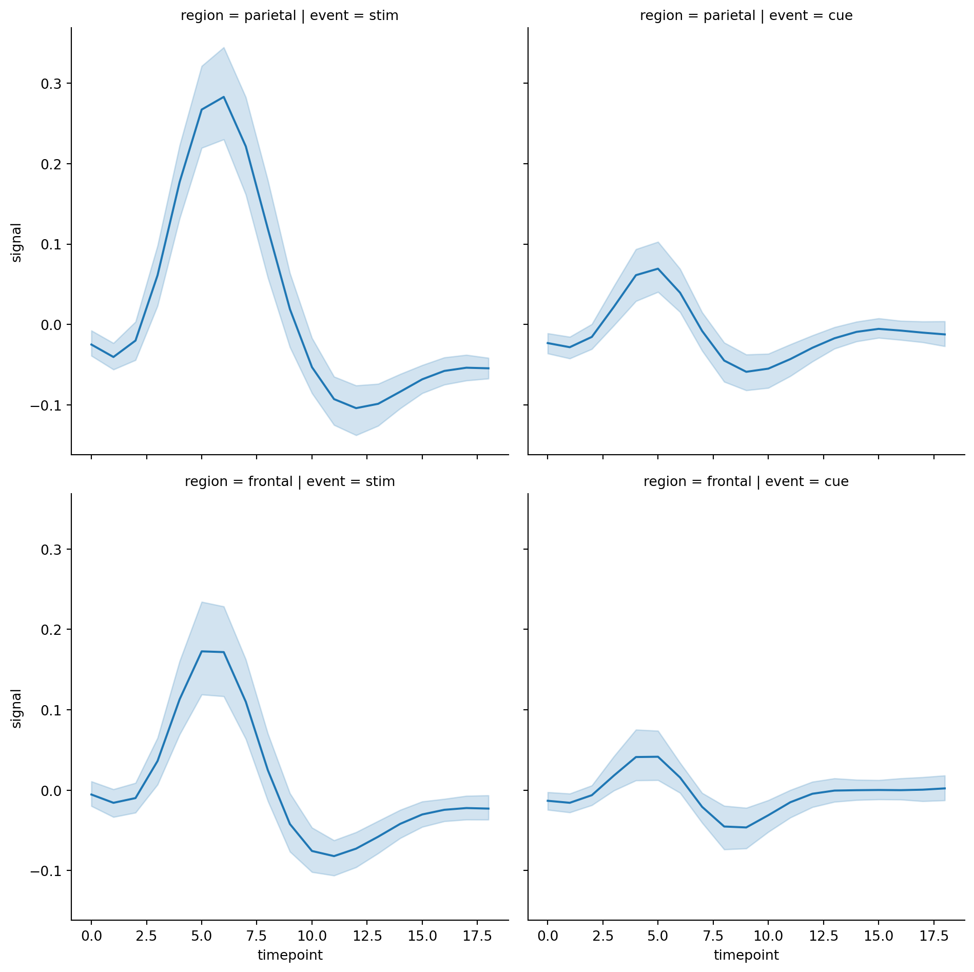
row="region",
col="event",
)