Email from colleague
Dear data-science colleague,
We will need to run a report/visualization daily or weekly to plot the change in exchange rates for USD, BGN, DKK, GBP and CHF. The European Central Bank publishes these rates but I don’t understand the format:https://www.ecb.europa.eu/stats/policy_and_exchange_rates/euro_reference_exchange_rates/html/index.en.html
The most recent data should be pulled automatically so the plots can be updated as new rates are published in the future.
Please make at least two plots, one with EUR as a baseline, and one with USD as a baseline.
Thanks, Your colleague
Parsing XML with XSL sheets
xsl:stylesheet version= "1.0" xmlns:xsl= "http://www.w3.org/1999/XSL/Transform" xmlns:gesmes= "http://www.gesmes.org/xml/2002-08-01" xmlns:ecb= "http://www.ecb.int/vocabulary/2002-08-01/eurofxref" exclude-result-prefixes= "gesmes ecb" >xsl:output method= "text" omit-xml-declaration= "yes" indent= "no" />xsl:template match= "/gesmes:Envelope" >xsl:text >Time,USD,JPY,BGN,CZK,DKK,GBP,CHF </xsl:text >xsl:for-each select= "ecb:Cube/ecb:Cube" >xsl:value-of select= "@time" />xsl:text >,</xsl:text >xsl:value-of select= "ecb:Cube[@currency='USD']/@rate" />xsl:text >,</xsl:text >xsl:value-of select= "ecb:Cube[@currency='JPY']/@rate" />xsl:text >,</xsl:text >xsl:value-of select= "ecb:Cube[@currency='BGN']/@rate" />xsl:text >,</xsl:text >xsl:value-of select= "ecb:Cube[@currency='CZK']/@rate" />xsl:text >,</xsl:text >xsl:value-of select= "ecb:Cube[@currency='DKK']/@rate" />xsl:text >,</xsl:text >xsl:value-of select= "ecb:Cube[@currency='GBP']/@rate" />xsl:text >,</xsl:text >xsl:value-of select= "ecb:Cube[@currency='CHF']/@rate" />xsl:text > </xsl:text >xsl:for-each >xsl:template >xsl:stylesheet >
rates.csv: eurofxref-hist-90d.xml eurofxref-hist-90d.xml:
From this, we can execute both commands in the Makefile with make rates.csv.
Import the csv into a pandas DataFrame in python
import pandas as pdfrom matplotlib import pyplot as pltimport seaborn as sns= pd.read_csv('rates.csv' ) # wrong, dates are not ordered correctly
Time     object
USD     float64
JPY     float64
BGN     float64
CZK     float64
DKK     float64
GBP     float64
CHF     float64
dtype: object
# make sure the first column is interpreted as a date = pd.read_csv('rates.csv' , parse_dates= ['Time' ])
Time    datetime64[ns]
USD            float64
JPY            float64
BGN            float64
CZK            float64
DKK            float64
GBP            float64
CHF            float64
dtype: object
= ['Time' , 'rate_USD' , 'rate_JPY' , 'rate_BGN' , 'rate_CZK' , 'rate_DKK' , 'rate_GBP' , 'rate_CHF' ]
0
2024-04-16
1.0637
164.54
1.9558
25.210
7.4609
0.85440
0.9712
1
2024-04-15
1.0656
164.05
1.9558
25.324
7.4606
0.85405
0.9725
2
2024-04-12
1.0652
163.16
1.9558
25.337
7.4603
0.85424
0.9716
3
2024-04-11
1.0729
164.18
1.9558
25.392
7.4604
0.85525
0.9787
4
2024-04-10
1.0860
164.89
1.9558
25.368
7.4594
0.85515
0.9810
...
...
...
...
...
...
...
...
...
57
2024-01-24
1.0905
160.46
1.9558
24.786
7.4568
0.85543
0.9415
58
2024-01-23
1.0872
160.88
1.9558
24.824
7.4574
0.85493
0.9446
59
2024-01-22
1.0890
160.95
1.9558
24.758
7.4585
0.85575
0.9458
60
2024-01-19
1.0887
161.17
1.9558
24.813
7.4575
0.85825
0.9459
61
2024-01-18
1.0875
160.89
1.9558
24.734
7.4571
0.85773
0.9432
62 rows × 8 columns
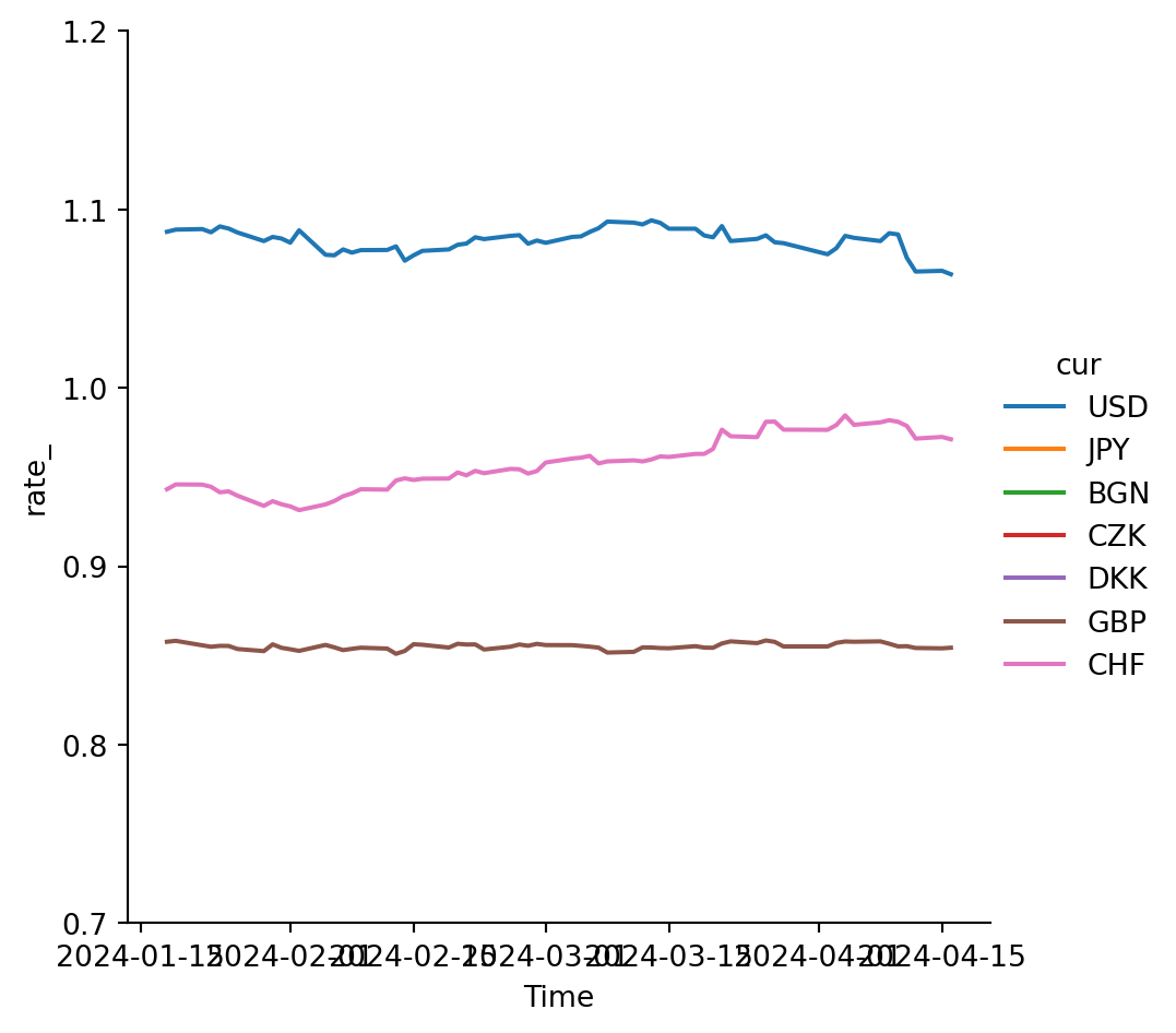
Visualization
Once we are within python, we can comfortably transform the DataFrame into a suitable format fore visualizations.
= pd.wide_to_long(df, stubnames= ['rate_' ], i= 'Time' , j= 'cur' , suffix= '[A-Z]*' )= 'Time' , y= 'rate_' , hue= 'cur' , kind= 'line' )0.7 , 1.2 )
Index(['rate_'], dtype='object')