Slides: Visualization with seaborn
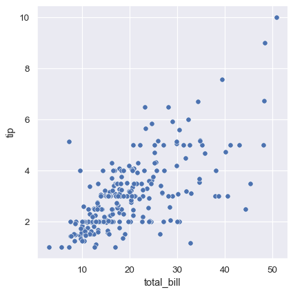
Simple scatter plot
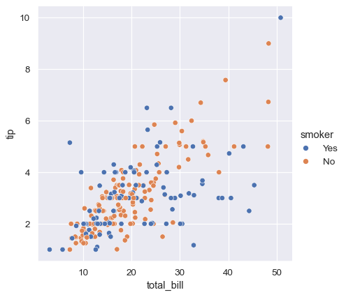
Simple scatter plot: different colors for different categorical value
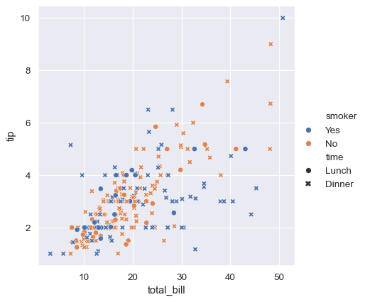
Different colors/markers based on categorical values
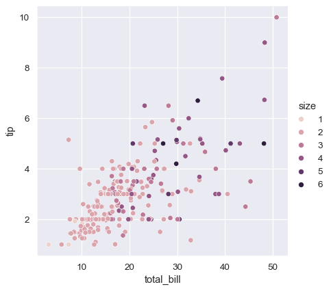
Add information about a third variable with color
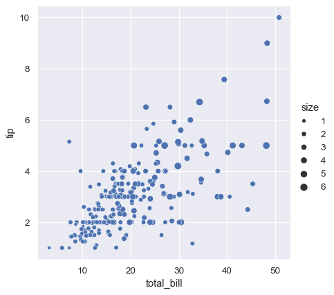
Add information about a third variable with size
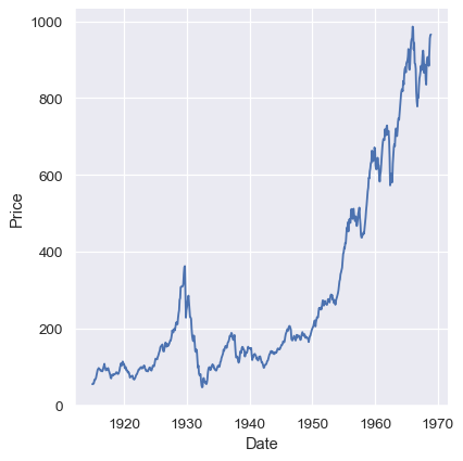
Stock prices
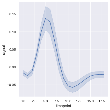
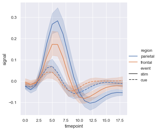
fMRI measurements (x-axis is time), several signals for each value of x
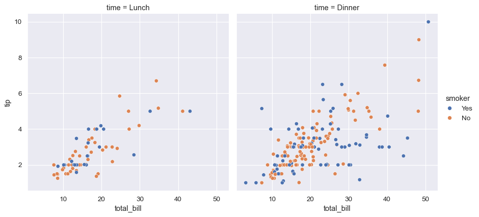
Plotting samples from different categories on different subplots
Plotting samples from different categories with different colors and styles
Histogram with continuous data

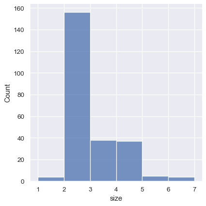
Histogram with discrete data (“party size”)
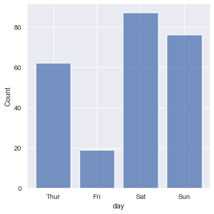
Histogram with discrete data (weekdays)
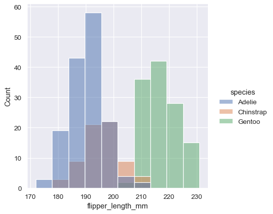
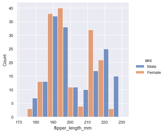
Distribution of data differentiated based on categorical variable
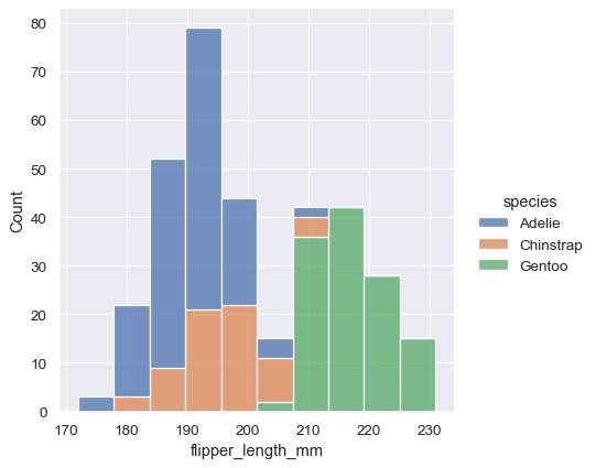
Histogram stacking versus histogram overlap
Histogram stacking versus histogram overlap versus dodge
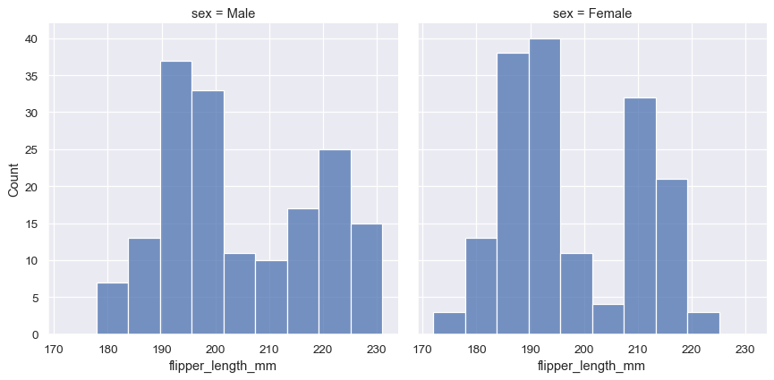
Different subplots for different value on a categorical variable
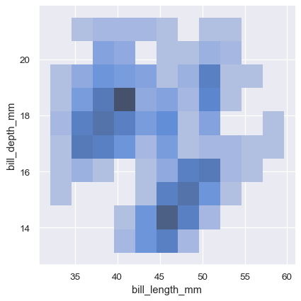
Histograms in 2d
KDE plots in 2d

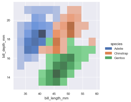
2d histograms differentiated with colors for different species
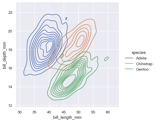
2d KDE plots differentiated with colors for different species
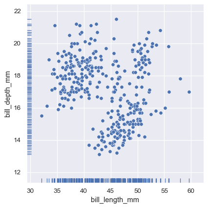
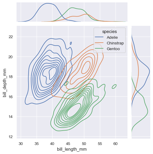
visualizing 2d distributions and 1d marginals
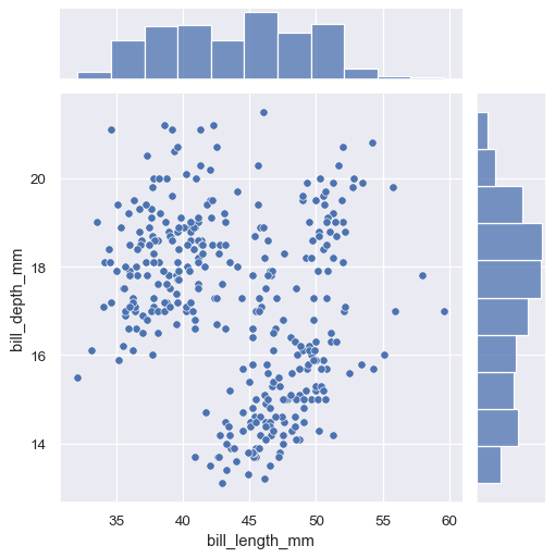
visualizing 2d distributions and 1d marginals
Rug: visualizing 2d dist AND 1d locations of single points