%%javascript
// disable scrolling for cells outputs, see https://stackoverflow.com/a/41646403
IPython.OutputArea.prototype._should_scroll = function(lines) {
    return false;
}Matplotlib plots from pandas
import pandas as pd
from matplotlib import pyplot as plt
df = pd.read_csv('rates.csv', parse_dates=['Time'])
df.head()| Time | USD | JPY | BGN | CZK | DKK | GBP | CHF | |
|---|---|---|---|---|---|---|---|---|
| 0 | 2024-01-17 | 1.0877 | 160.65 | 1.9558 | 24.755 | 7.4586 | 0.85818 | 0.9406 |
| 1 | 2024-01-16 | 1.0882 | 159.64 | 1.9558 | 24.710 | 7.4582 | 0.86078 | 0.9361 |
| 2 | 2024-01-15 | 1.0945 | 159.67 | 1.9558 | 24.714 | 7.4590 | 0.86075 | 0.9351 |
| 3 | 2024-01-12 | 1.0942 | 159.17 | 1.9558 | 24.689 | 7.4565 | 0.85950 | 0.9350 |
| 4 | 2024-01-11 | 1.0987 | 159.71 | 1.9558 | 24.659 | 7.4568 | 0.86145 | 0.9338 |
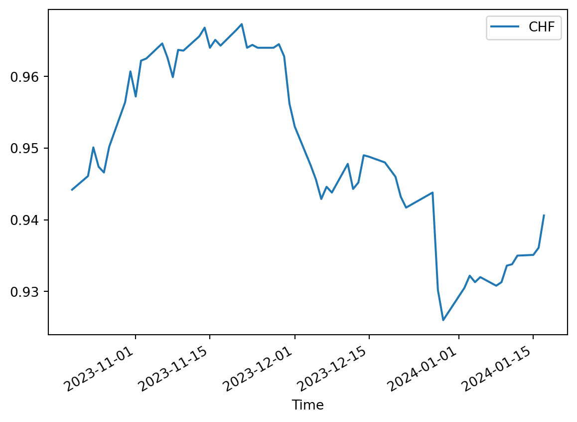
# here we do not take control over which "ax" object the curves are plotted on
df.plot(x='Time', y='USD', kind='line')
df.plot(x='Time', y='CHF', kind='line')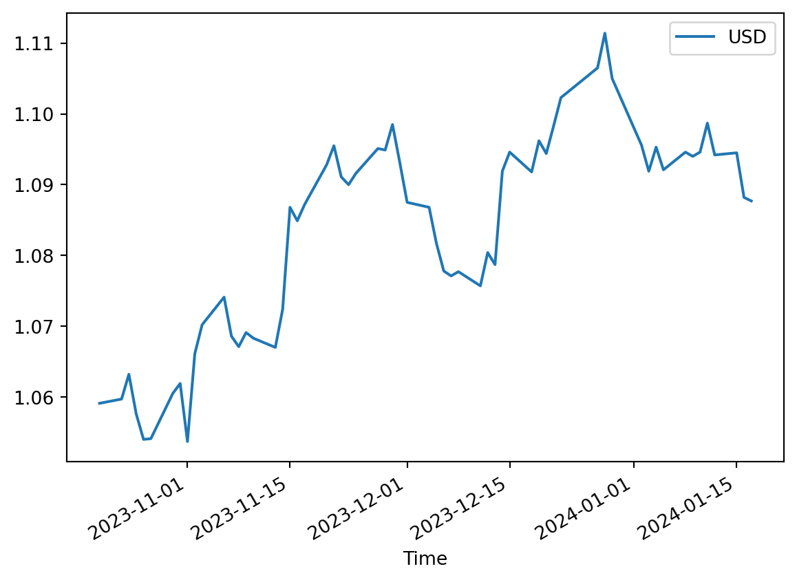
# here we do not take control over which "ax" object the curves are plotted on
df.USD.hist()
df.CHF.hist()
Anatomy of a matplotlib figure
Credits: https://matplotlib.org/stable/gallery/showcase/anatomy.html#anatomy-of-a-figure

Taking control of where to plot curves with subplots
Credits: https://matplotlib.org/3.1.0/gallery/subplots_axes_and_figures/subplots_demo.html
Draw two curves on one ax
my_current_ax = plt.gca() # get the single current ax created by default
df.plot(x='Time', y='USD', kind='line', ax=my_current_ax)
df.plot(x='Time', y='CHF', kind='line', ax=my_current_ax)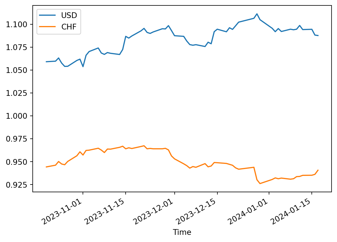
my_current_ax = plt.gca() # get the single current ax created by default
df.USD.hist(ax=my_current_ax)
df.CHF.hist(ax=my_current_ax)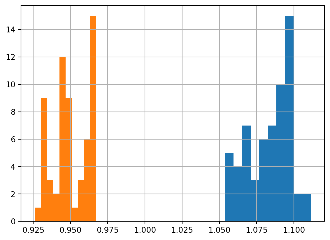
Two horizontal subplots
fig, axs = plt.subplots(ncols=2)
type(axs), len(axs)
df.USD.hist(ax=axs[0])
df.CHF.hist(ax=axs[1])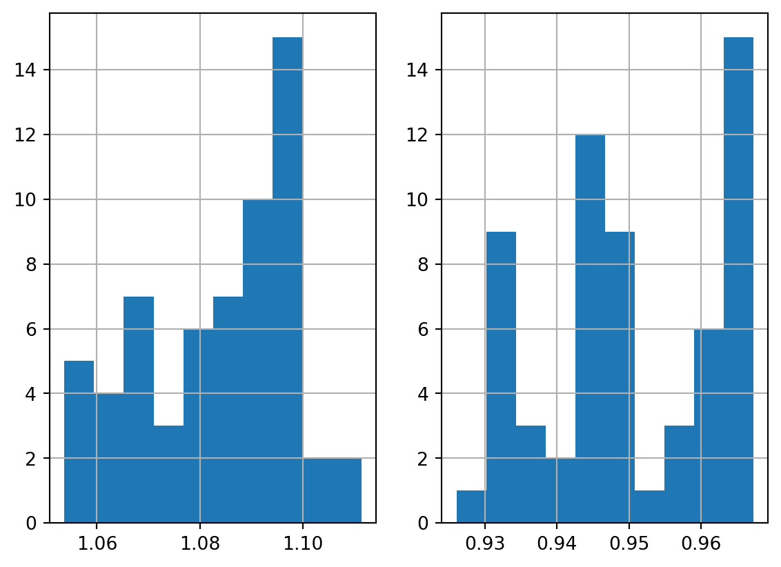
df.plot(x='Time', y=['USD', 'CHF'], kind='line')
# from https://matplotlib.org/stable/users/explain/axes/arranging_axes.html#basic-2x2-grid
def annotate_axes(ax, text, fontsize=18):
ax.text(0.5, 0.5, text, transform=ax.transAxes,
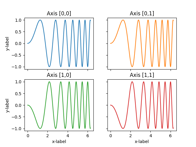
ha="center", va="center", fontsize=fontsize, color="darkgrey")Two by two grid of subplots
# from https://matplotlib.org/stable/users/explain/axes/arranging_axes.html#basic-2x2-grid

fig, axs = plt.subplots(ncols=2, nrows=2, figsize=(5.5, 3.5),
                        layout="constrained")
# add an artist, in this case a nice label in the middle...
for row in range(2):
    for col in range(2):
        axs[row, col].annotate(f'axs[{row}, {col}]', (0.5, 0.5),
                               transform=axs[row, col].transAxes,
                               ha='center', va='center', fontsize=18,
                               color='darkgrey')
df.USD.plot(x='Time', ax=axs[0,0])
df.CHF.plot(x='Time', ax=axs[1,1])
df.BGN.plot(x='Time', ax=axs[1,0])


fig.suptitle('plt.subplots()')
Text(0.5, 0.98, 'plt.subplots()')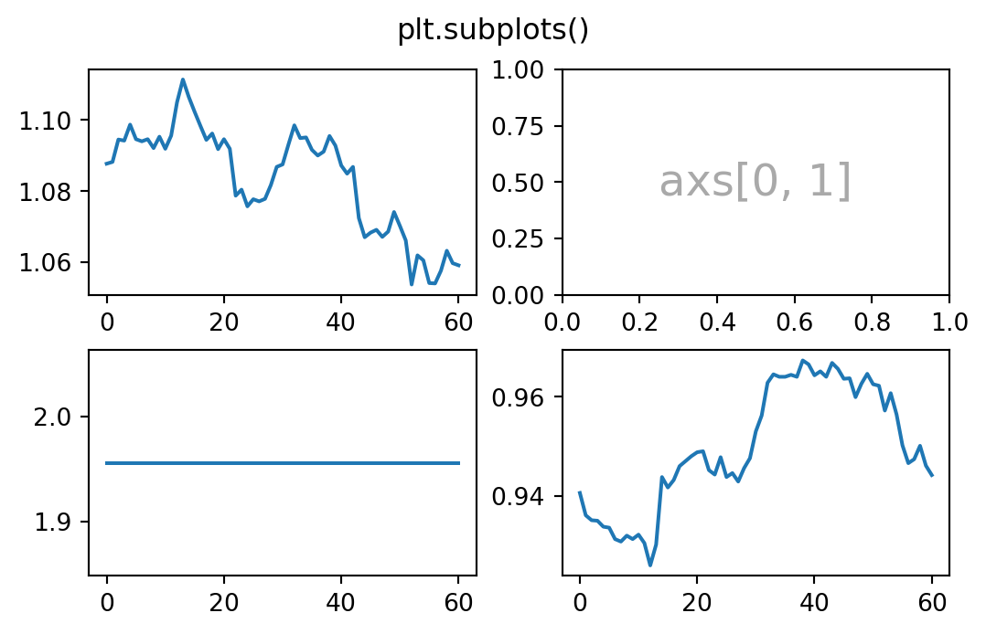
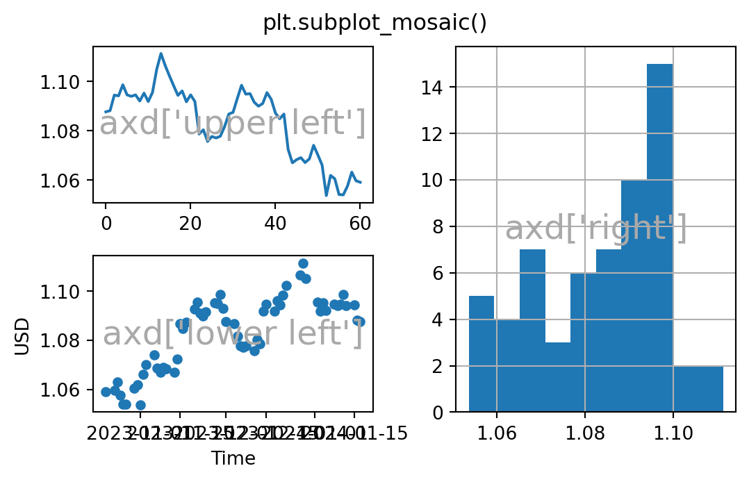
Mosaic subplots
# from https://matplotlib.org/stable/users/explain/axes/arranging_axes.html#basic-2x2-grid


fig, axd = plt.subplot_mosaic([['upper left', 'right'],
                               ['lower left', 'right']],
                              figsize=(5.5, 3.5), layout="constrained")
for k, ax in axd.items():
    annotate_axes(ax, f'axd[{k!r}]')
fig.suptitle('plt.subplot_mosaic()')
df.USD.plot(ax=axd['upper left'])
df.USD.hist(ax=axd['right'])
df.plot.scatter(x='Time', y='USD', ax=axd['lower left'])