import numpy as np
import pandas as pd
import matplotlib.pyplot as plt
import seaborn as snsII Visualization of distributional data (“displot”)
%%javascript
IPython.OutputArea.prototype._should_scroll = function(lines) {
    return false; // disable auto scrolling
}
penguins = sns.load_dataset("penguins")
penguins.head()| species | island | bill_length_mm | bill_depth_mm | flipper_length_mm | body_mass_g | sex | |
|---|---|---|---|---|---|---|---|
| 0 | Adelie | Torgersen | 39.1 | 18.7 | 181.0 | 3750.0 | Male |
| 1 | Adelie | Torgersen | 39.5 | 17.4 | 186.0 | 3800.0 | Female |
| 2 | Adelie | Torgersen | 40.3 | 18.0 | 195.0 | 3250.0 | Female |
| 3 | Adelie | Torgersen | NaN | NaN | NaN | NaN | NaN |
| 4 | Adelie | Torgersen | 36.7 | 19.3 | 193.0 | 3450.0 | Female |
Histogram with continuous data
sns.displot(penguins,
            x="flipper_length_mm")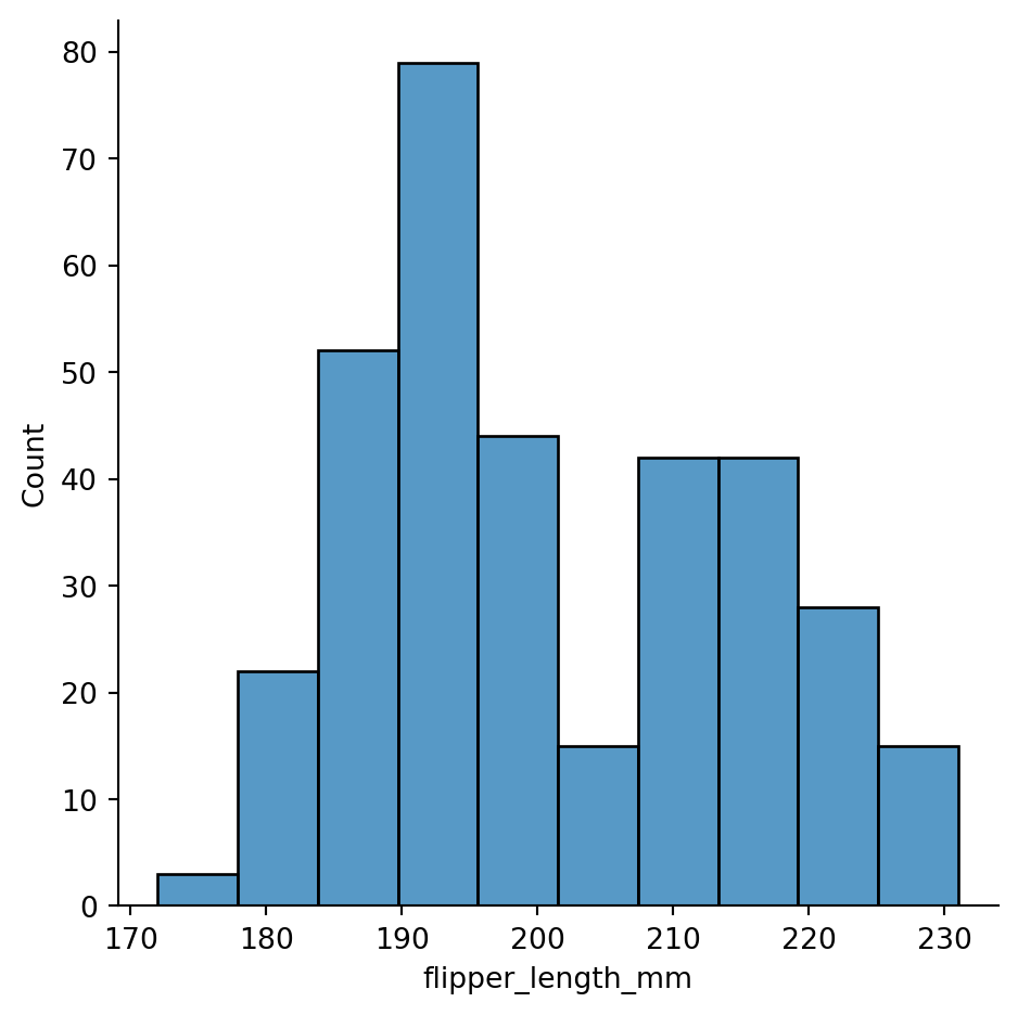
sns.displot(penguins,
            x="flipper_length_mm",
            binwidth=7.1)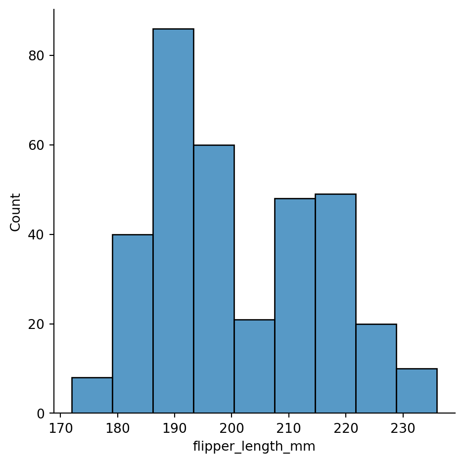
sns.displot(penguins,
            x="flipper_length_mm",
            bins=20)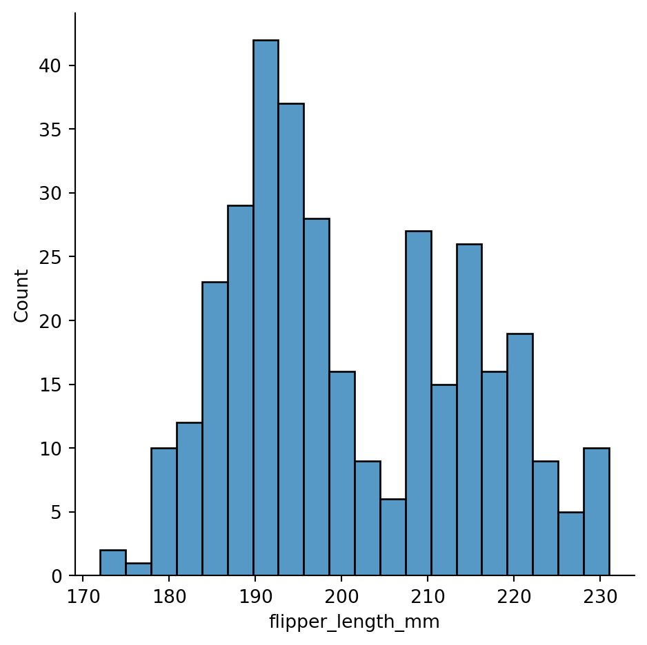
Bindwidths too small can break histograms
sns.displot(penguins, x="flipper_length_mm",
            binwidth=0.3)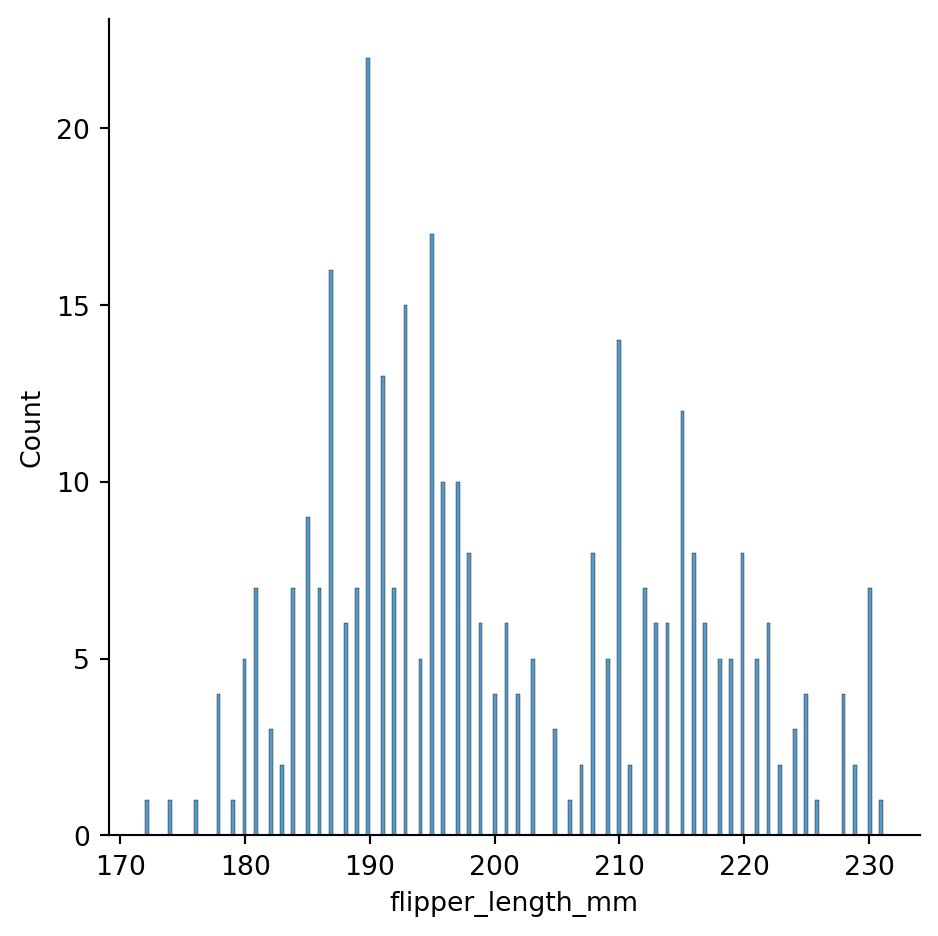
sns.displot(penguins,
            x="flipper_length_mm",
            binwidth=30) # binwdith too big, the two hills in the data are not visible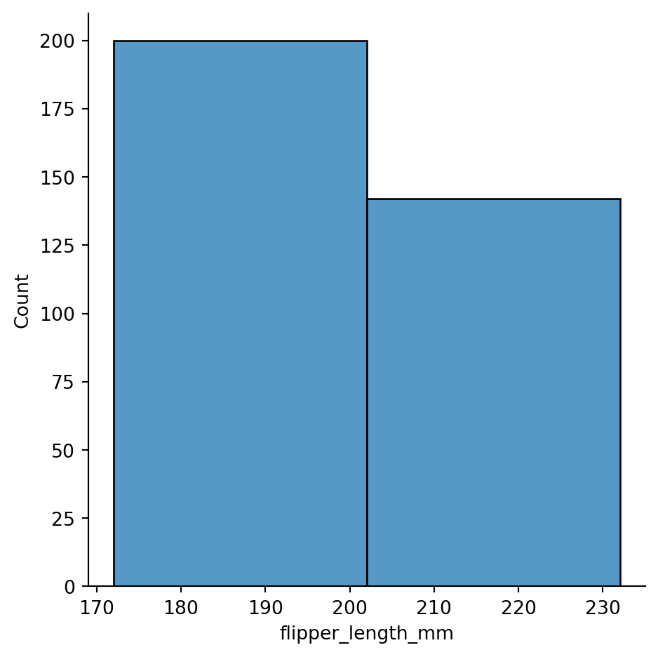
sns.displot(penguins,
            x="flipper_length_mm",
            bins=15)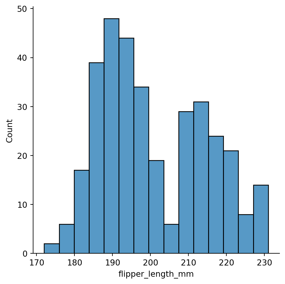
Histogram with discrete data (“party size”)
tips = sns.load_dataset("tips")
tips.head()| total_bill | tip | sex | smoker | day | time | size | |
|---|---|---|---|---|---|---|---|
| 0 | 16.99 | 1.01 | Female | No | Sun | Dinner | 2 |
| 1 | 10.34 | 1.66 | Male | No | Sun | Dinner | 3 |
| 2 | 21.01 | 3.50 | Male | No | Sun | Dinner | 3 |
| 3 | 23.68 | 3.31 | Male | No | Sun | Dinner | 2 |
| 4 | 24.59 | 3.61 | Female | No | Sun | Dinner | 4 |
sns.displot(tips,
            x="size",
            discrete=True)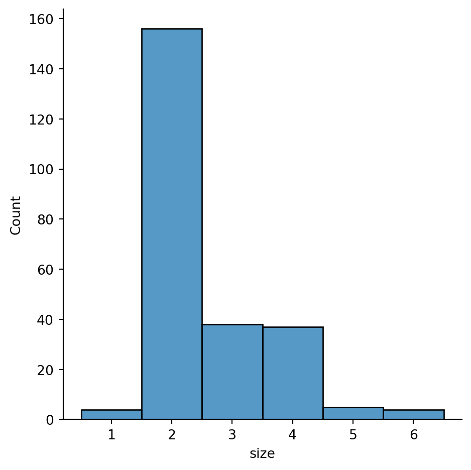
Histogram with discrete data (weekdays)
sns.displot(tips,
            x="day")
# no need to specify discrete=True beacuse seaborn figures it out on its own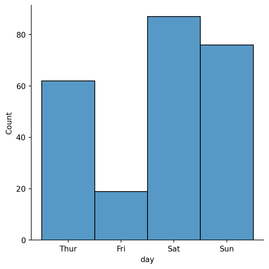
Distribution of data differentiated based on categorical variable
sns.displot(penguins,
            x="flipper_length_mm",
            hue="species")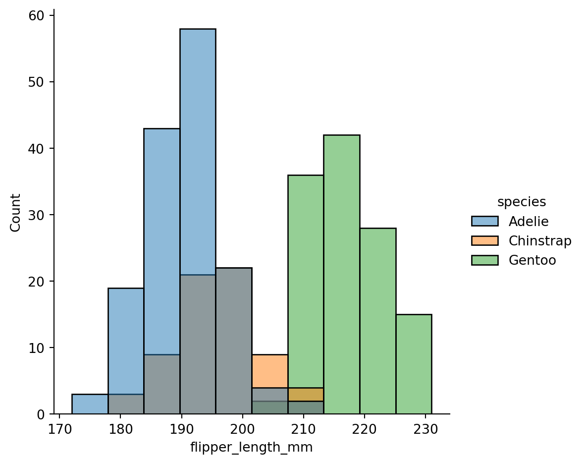
sns.displot(penguins,
            x="flipper_length_mm",
            hue="species",
            col='island')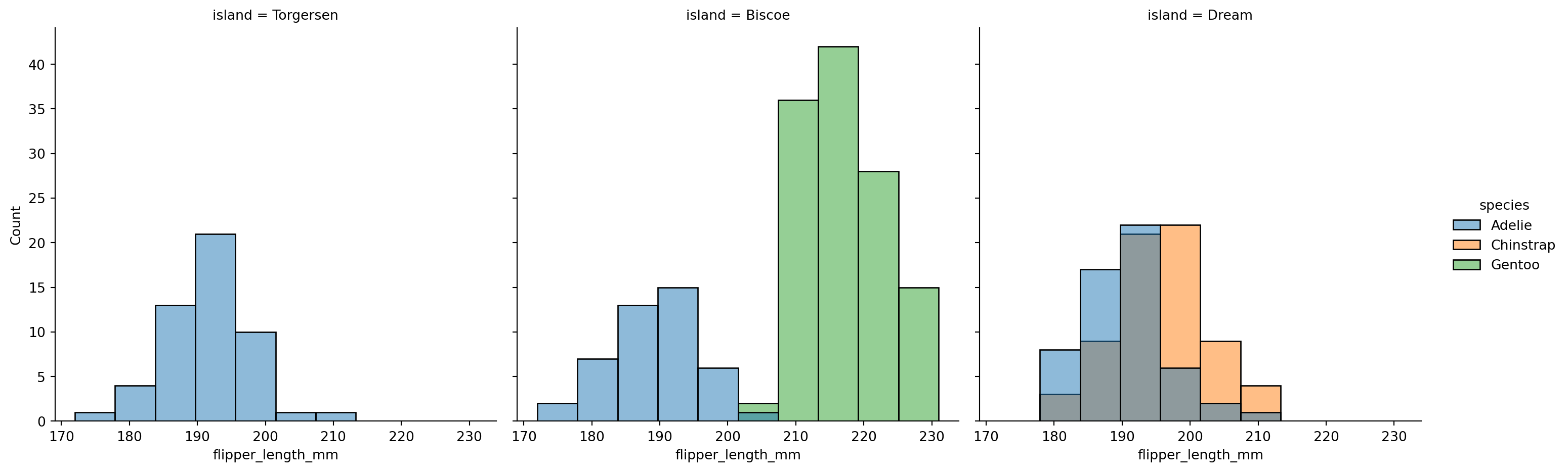
Histogram stacking versus histogram overlap
With stacking:
sns.displot(penguins,
            x="flipper_length_mm",
            hue="species",
            multiple="stack")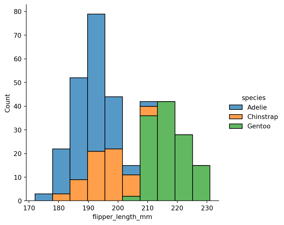
Histogram stacking versus histogram overlap versus dodge
With dodging:
sns.displot(penguins,
            x="flipper_length_mm",
            hue="species",
            multiple="dodge")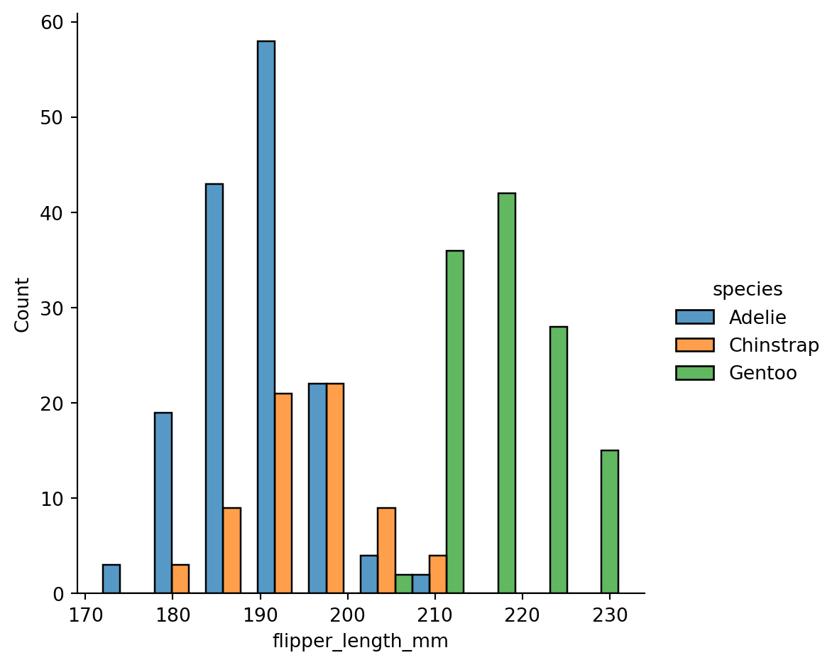
Different subplots for different value on a categorical variable
sns.displot(penguins,
            x="flipper_length_mm",
            col="sex")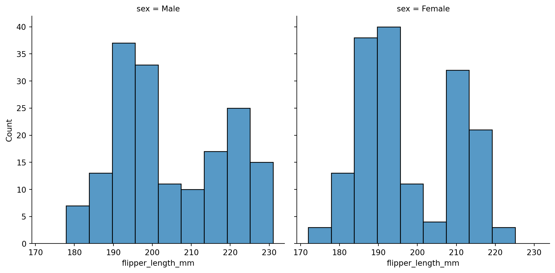
sns.displot(penguins,
            x="flipper_length_mm",
            col="sex",
            hue='species',
            row='island',
            multiple="dodge")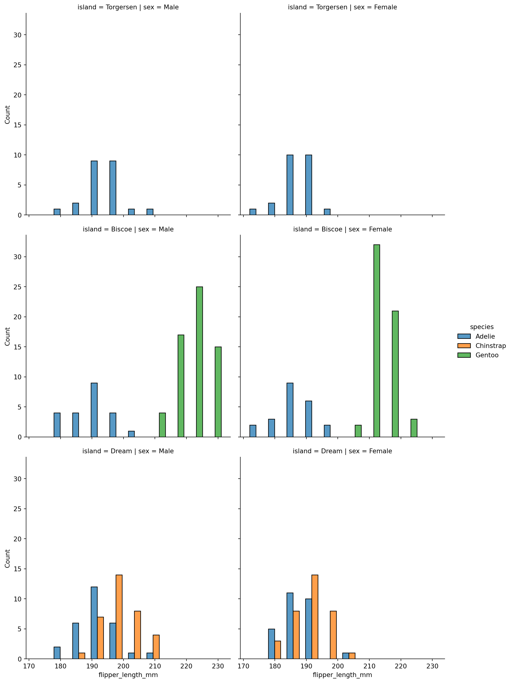
Kernel Density Estimation (KDE) plots to smooth histograms
sns.displot(penguins,
            x="flipper_length_mm",
            kind="kde")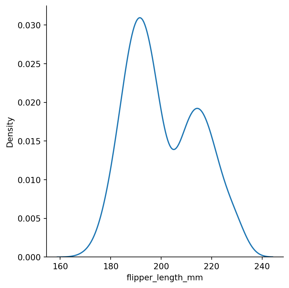
sns.displot(penguins,
            x="flipper_length_mm",
            kind="kde",
            bw_method=0.05) # setting the bandwidth
# overfitting
# curve is jittery and the jitter is from noise, bandwidth is too small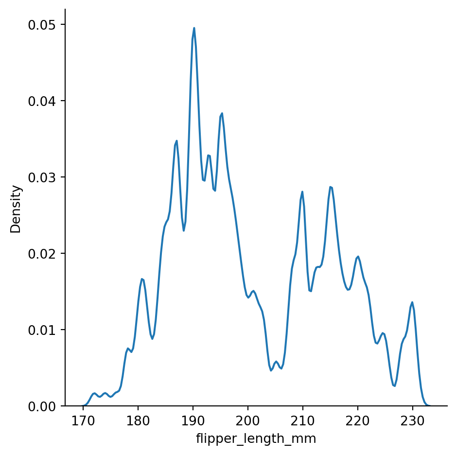
sns.displot(penguins,
            x="flipper_length_mm",
            kind="kde",
            bw_method=0.3) # setting the bandwidth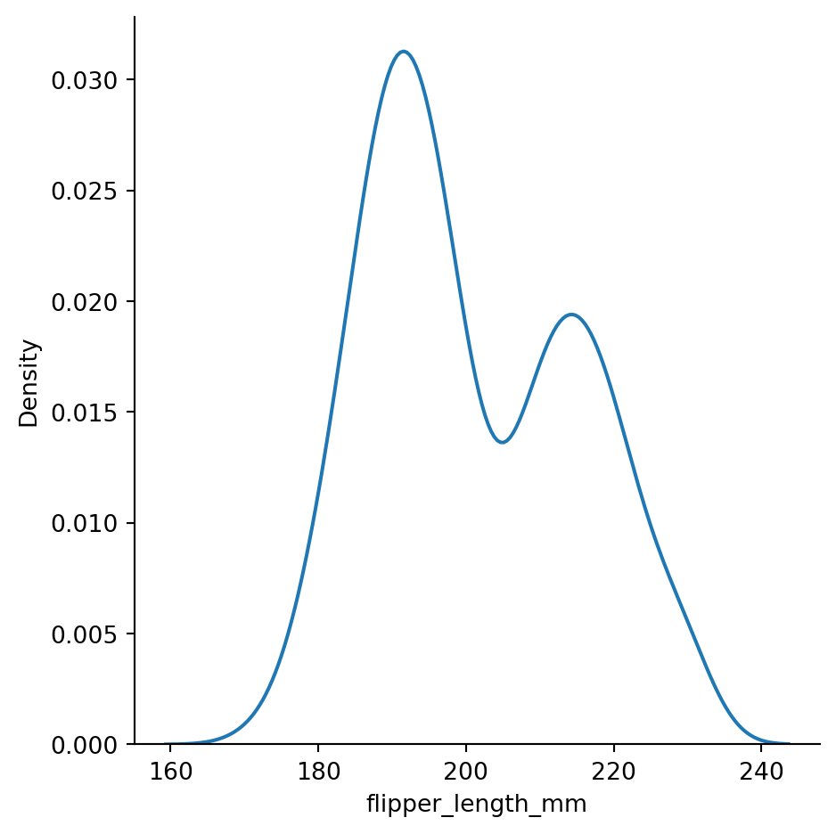
sns.displot(penguins,
            x="flipper_length_mm",
            kind="kde",
            bw_method=2) # setting the bandwidth
# underfitting:
# bandwidth too big, curve too smoothed out, not informative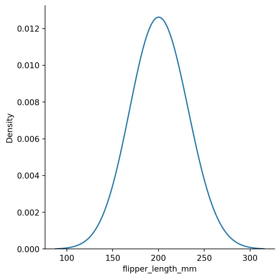
sns.displot(penguins,
            x="flipper_length_mm",
            hue="species",
            kind="kde")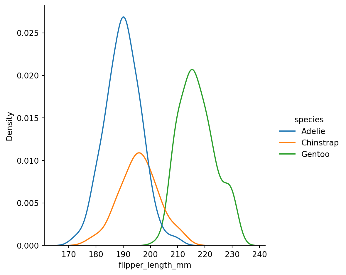
sns.displot(penguins,
            x="flipper_length_mm",
            hue="species",
            col='island',
            kind="kde")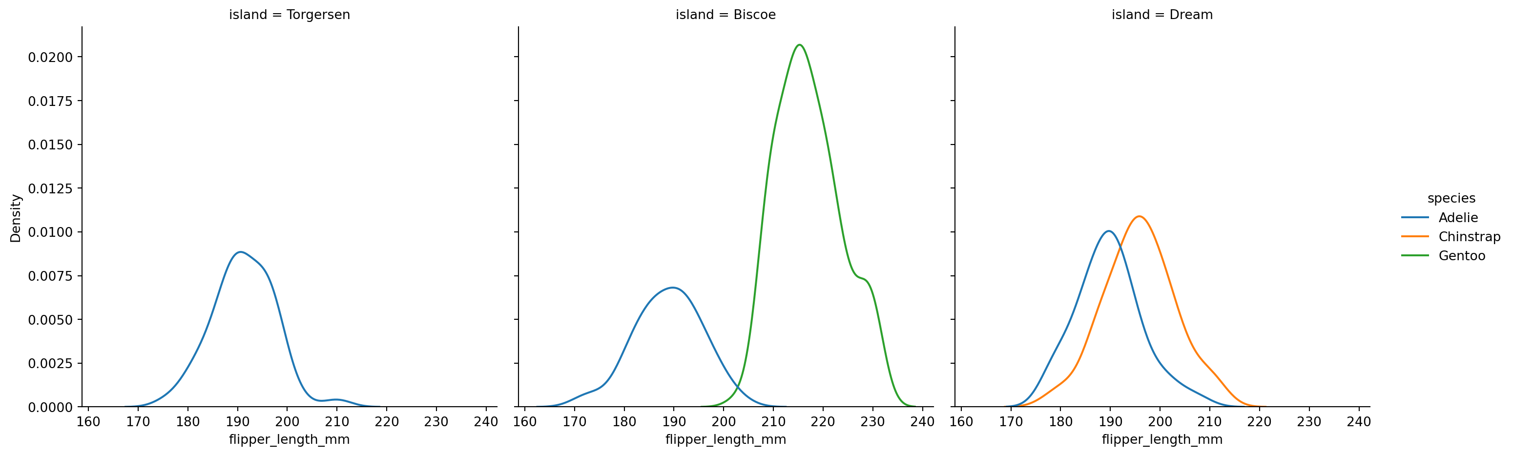
sns.displot(penguins,
            x="flipper_length_mm",
            hue="species",
            kind="kde",
            fill=True)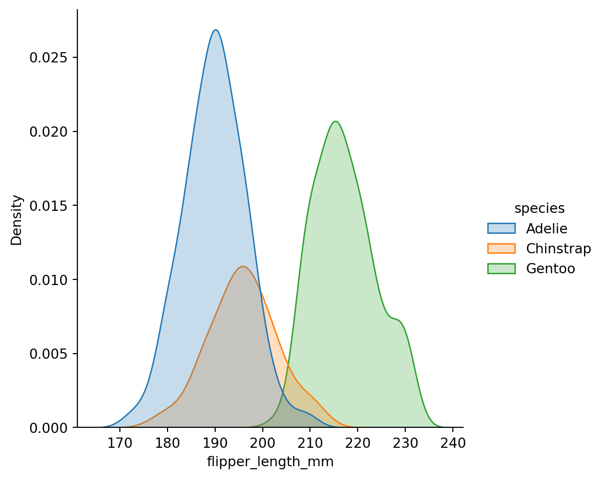
sns.displot(penguins,
            x="flipper_length_mm",
            hue="species",
            kind="kde",
            fill=True,
            multiple="stack")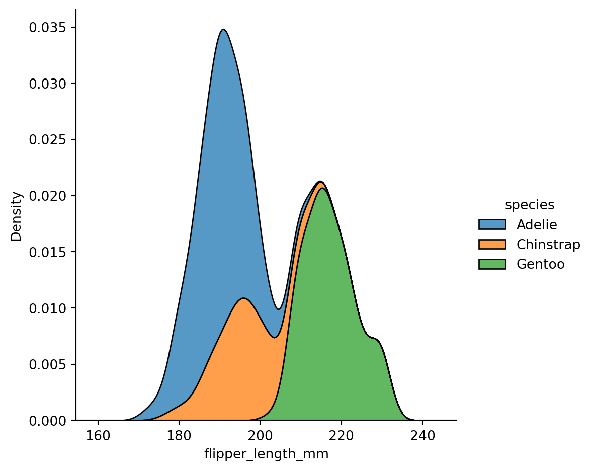
2-dimensional distributional plots
Histograms in 2d (also known as heatmap)
sns.displot(penguins,
            x="bill_length_mm",
            y="bill_depth_mm")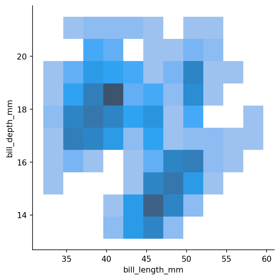
sns.displot(penguins,
            x="bill_length_mm",
            y="bill_depth_mm",
            cbar=True) # adding a colorbar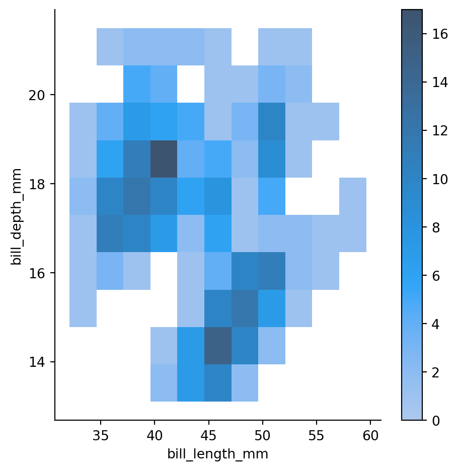
sns.jointplot(penguins,
            x="bill_length_mm",
            y="bill_depth_mm",
            kind='hex')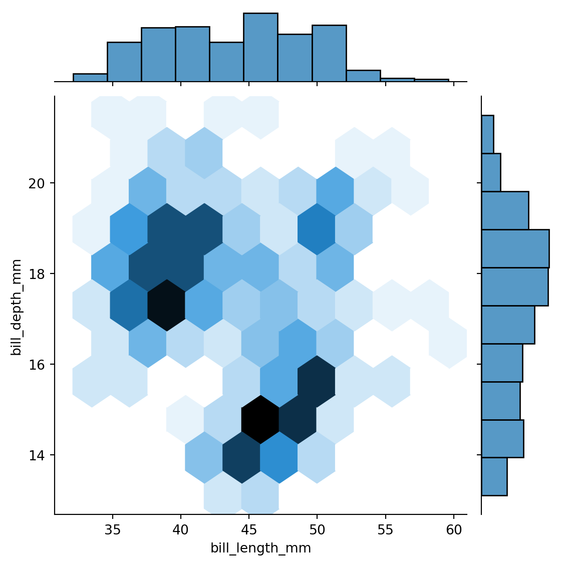
KDE plots in 2d
sns.displot(penguins,
            x="bill_length_mm",
            y="bill_depth_mm",
            kind="kde")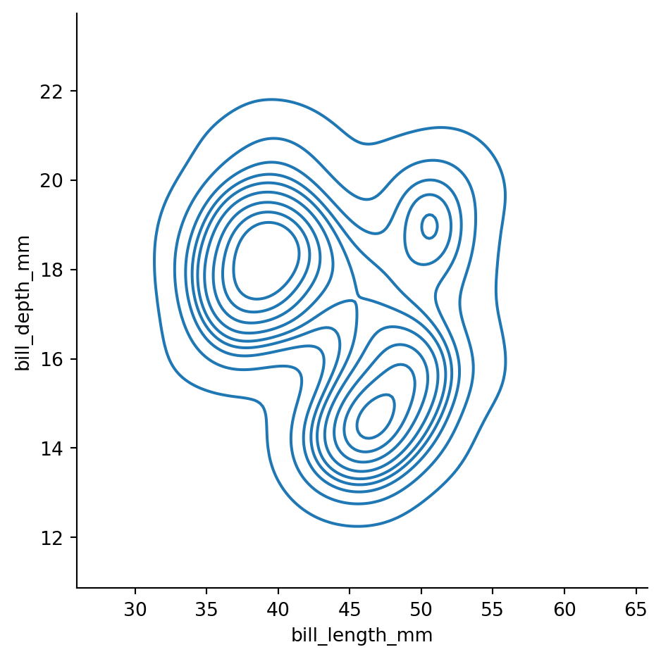
Controlling the number of isolines and the threshold for the smallest isoline
sns.displot(penguins,
            x="bill_length_mm",
            y="bill_depth_mm",
            kind="kde",
            levels=12,
            thresh=0.02)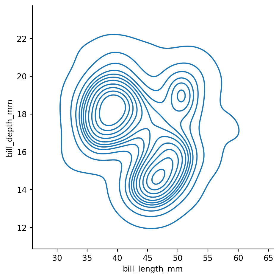
2d histograms differentiated with colors for different species
sns.displot(penguins,
            x="bill_length_mm",
            y="bill_depth_mm",
            hue="species",
            col='island')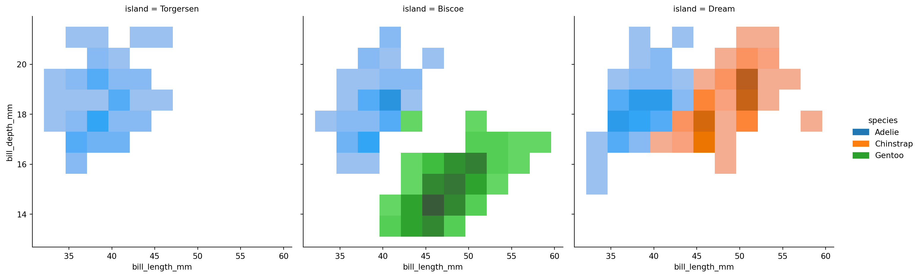
2d KDE plots differentiated with colors for different species
sns.displot(penguins,
            x="bill_length_mm",
            y="bill_depth_mm",
            hue="species",
            col='island',
            kind="kde")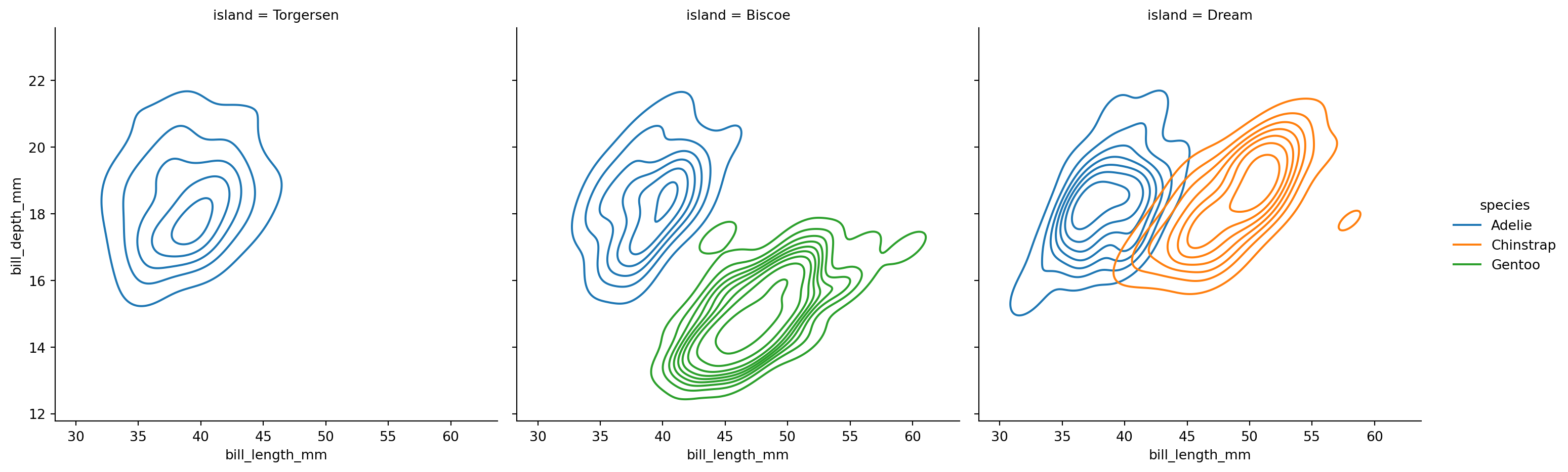
Changing binwidth (in two diretions)
sns.displot(penguins,
            x="bill_length_mm",
            y="bill_depth_mm",
            binwidth=(3, 1))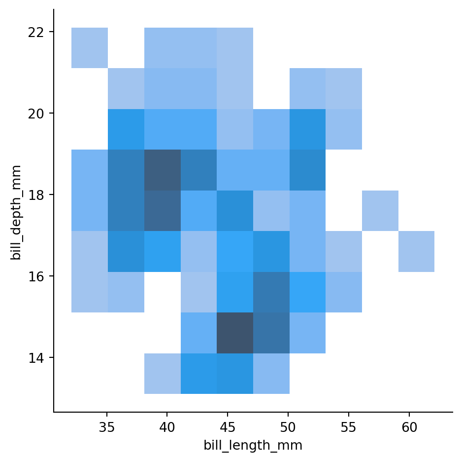
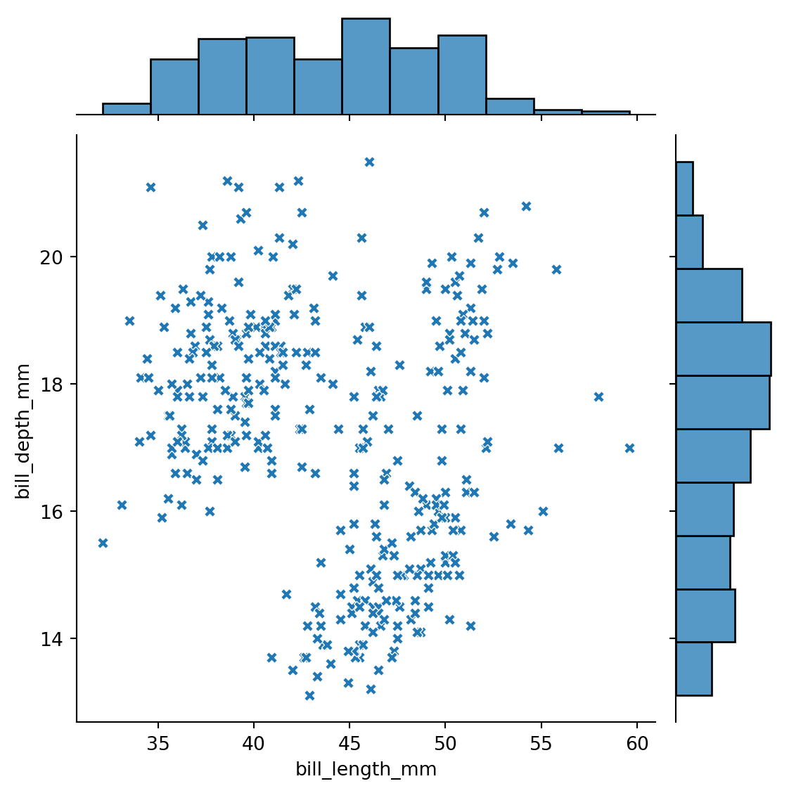
Visualizing 2d distributions and 1d marginals with sns.jointplot()
sns.jointplot(data=penguins,
              x="bill_length_mm",
              y="bill_depth_mm",
              marker='X'
             )
sns.jointplot(data=penguins,
x="bill_length_mm",
y="bill_depth_mm",
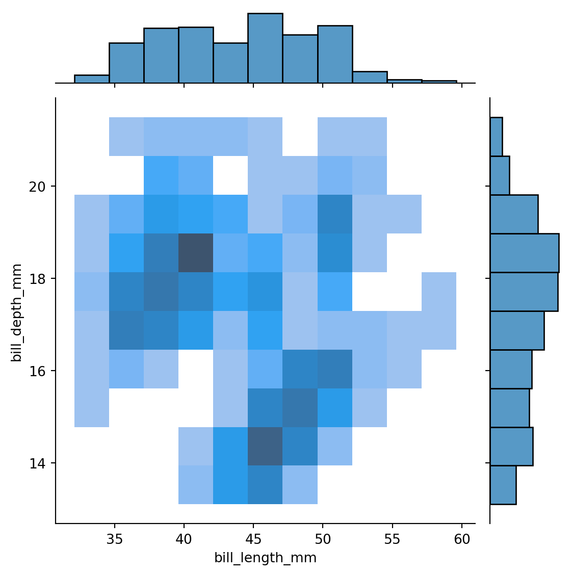
kind='hist'
)
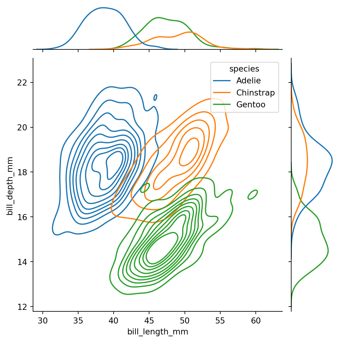
sns.jointplot(data=penguins,
              x="bill_length_mm",
              y="bill_depth_mm",
              hue='species',
              kind='kde'
             )
visualizing 2d distributions and 1d marginals
sns.jointplot(
    data=penguins,
    x="bill_length_mm",
    y="bill_depth_mm",
    hue="species",
    kind="kde"
)
sns.jointplot(penguins,
            x="bill_length_mm",
            y="bill_depth_mm",
            hue="species",
            kind="kde")
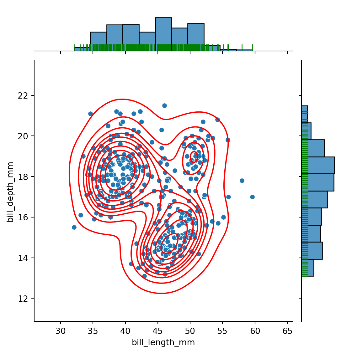
Rug: visualizing 2d dist AND 1d locations of single points
Multiple layers: for instance, both scatter plot and KDE plots, both rugs and marginal plots
g = sns.jointplot(data=penguins,
                  x="bill_length_mm",
                  y="bill_depth_mm")

g.plot_joint(sns.kdeplot,
             color="red")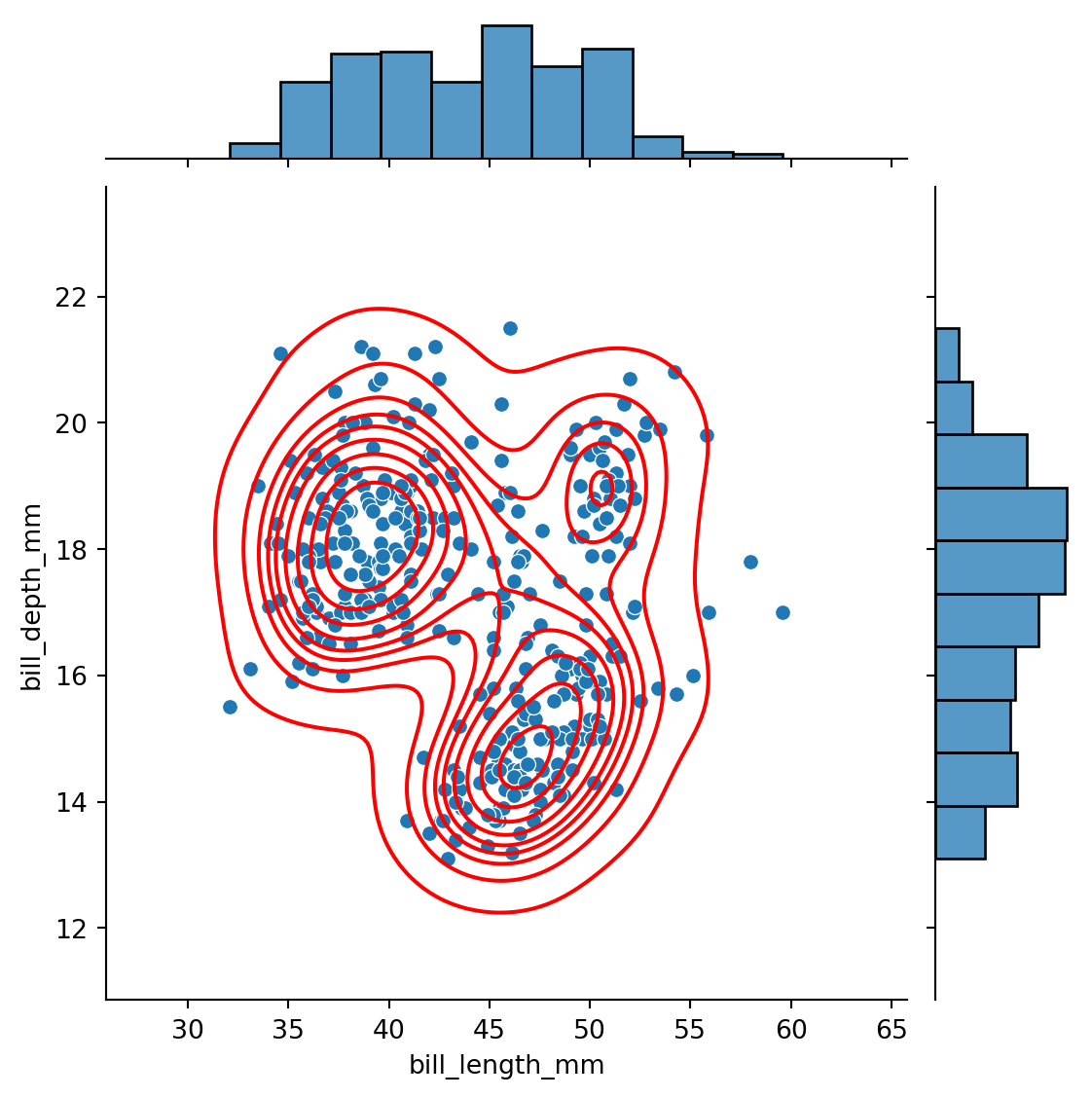
# scatter plot in blue
g = sns.jointplot(data=penguins,
                  x="bill_length_mm",
                  y="bill_depth_mm")

# kde plot in red, same plot
g.plot_joint(sns.kdeplot,
             color="red")

# rug plot in green
g.plot_marginals(sns.rugplot,
                 color="green", height=0.15)